www.shakeaway.com
Shakeaway is the original re-inventor of milkshakes and
started a cult following in 1999 with the first shop opening in the sunny
seaside town of Bournemouth, people liked it so much, they now have stores all
over the world.
The founders of Shakeaway thought there should be more to
the humble milkshake, by blending a packet of Rolos with milk and ice cream, the
first Shakeaway style milkshake was born. Now with over 180 flavours and
millions of possible combinations, every milkshake is made freshly to order for
every customer. The menus have extended
so much, from the Main Menu; they have now introduced the 'Hot Menu', the 'Spring
Menu', the 'New American Menu' and the 'Famous Named Shakes.'
The website
The layout of the website is very simple, but keeps with the colour theme, linking well to the overall company branding. The black type used for the body copy is very easy to read and clear against the white space. The reverse type and coloured text against the coloured backgrounds works really well, as it creates a fun, happy atmosphere for the customers. It also makes the website understandable, and again the colours are linked to the overall colour theme of the company.

By bringing in loyalty cards, it means that the customers are more willing to keep coming back - repeat purchase. I feel that this would be a really good idea, especially as it is free, as it means that the customers are entitled to great offers - which is a great way of gaining more customers, and as people find out, it will get bigger and more popular.

Logo
The logo is very distinct and very clear. There are no images used, yet it is very recognisable and unique. The colours in the background make the type in the foreground stand out. From the colour, to the typeface, and the brightness, the logo is legible and eye catching. The pink fill with the black outline makes the name stand out immensely. The font creates a fun theme for all ages, and the colours mean that its focuses to both genders. The yellow creates a bright feeling, the blue creates a calm feeling and the pink creates a fun feeling.
The milkshake cup
The cup links very well to the logo above, with the name at the top and the yellow and blue stripes going down the cup. I feel that by using a couple of the stripes for the name of the customer, what flavour they want and any extras they would like is a great way to easily communicate to the other employers what milkshakes they need to create. It is also a lot less time consuming, making customer service a lot more quicker and efficient.

The exterior
The exterior of the bar looks very open and welcoming, as the bright colours catch your attention. The open window is a great idea, as most customers like to see what it looks like inside, before making their mind up and using their services. The coloured and reverse type on the window makes it look more interesting and appealing, which is something I would definitely think about.

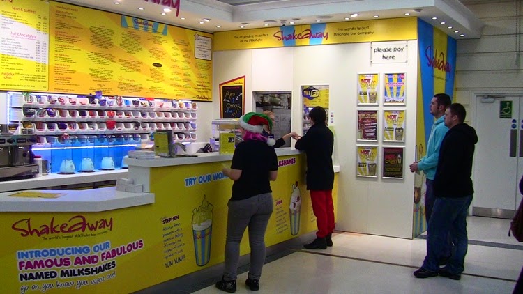
The interior
The interior also looks very bright, linking both the interior and exterior together. The bright yellow works really well, as it creates a happy environment, which is what milkshakes bring too! There isn't too much going on, which is good as it wont look too overcrowded when more customers come inside. The colour theme is kept throughout the whole Shakeaway experience, making it easily recognisable. There is a lot of imagery, both wall illustrations and photography, making it more exciting when ordering. The large menu above the front desk means that all of the customers can easily read what they offer, without having to be too close to the front or one another, or squint to read the body copy.
History of the menus
The first menu design was very basic, making it look boring and unexciting. There is no imagery, which means it doesn't catch anyone's attention. I don't understand the blue 'V' across the page, making the body copy harder to read. All of the information is the same point size, colour and font, making it harder to understand what is what and when taking all of the information in. The only thing good about this design, is that they kept with the colour theme, which I noticed they have done in each new menu they have designed and used.

In this design, they then started adding imagery, making it look more fun. However, I don't understand the placement of the images, as it makes the layout seem bulky and busy. They are the same images and they make the body copy harder to read as the text overlaps the images. I have noticed however that the blue 'v' has gone, which does improve the layout when reading the menu.

This design is a lot more simple, with less going on so the customers are able to understand what is included and take all of the information in easily. The negative space is a lighter tone of yellow, making the body copy easier to read. I noticed they have added colours to the subheadings, making it easier to distinguish what is on the menu. They have changed to typeface of the subheadings, meaning it looks more fun and legible. The layout is also a lot more clear and understanding, meaning customers can easily read what they offer quickly and effectively, without wasting too much time. The title doesn't work as well against the different tone of yellow, instantly making my eyes turn away.

In this design, they definitely thought about layout, as it is much clearer and easier, especially when the customer is reading what they offer. There is more spacing, which is very helpful, but is also makes the menu look a little plain. The overall layout is a lot more exciting as they have included one large image, funky typefaces and colours! The colours used are much bolder, both in the background and in the foreground, making it clearer to read. They brought back the original design of the name, making it easier to recognise and it looks more appealing.

Current menu
I love the current menu design as there is more going on, meaning it doesn't look too empty and isn't too crowded either. The glow behind each subheading means that they pink font is easier to read against the yellow negative space. The smaller sized imagery going down the menu, in between each column makes it exciting and interesting, as they aren't too bold, and the customer is still able to read the text in front easily too. The different alignment of type creates an interesting layout design, and is more intriguing to read. The opacity of the name has decreased, however it does mean that customers can still easily recognise it as it has been increasing sales.

Current website menu
The online menu is very different to the paper layouts as the colour theme is completely different, however each different menu is easy to distinguish from the next. the typefaces are simple, which is better when it is online, depending on the person and screen resolution. It is very simple, with no imagery, however this doesn't matter as much, as the website includes a lot of imagery.

Social media
I feel that by including links to social media, it widens the amount of customers they will get, as more people are using social media these days. On the website, they are placed very clearly at the top, at a reasonable size, meaning that anyone is able to recognise them. I feel that these links would be great on the paper menu layouts, meaning that the customers are able to see the links even if they haven't got access to the links at that very moment.

Overall, I love Shakeaway's corporate identity, as it is very recognisable and very clear on what they are selling. Their target market is everyone, as both the handheld and online menu is easy to read and understand, the type is clear and the colours are not too overpowering. Everyone who loves milkshakes will love this, and that is what they have achieved!
No comments:
Post a Comment